
Bellabeat is a wellness-tech company that designs health-focused smart products for women. This case study looks at how the brand could sharpen its marketing strategy by analyzing activity-tracking data from a comparable fitness device, uncovering usage patterns that point toward where Bellabeat's growth opportunity really lies.
I am solving for business growth via marketing strategy based on the insights from analyzing non-Bellabeat product tracking data.
The data is stored within the Posit Cloud Library
The datasets are in general long format.
The data has its limitations owning to the collection date of the data and a few missing data points that are integral to solving the problem at hand. Although the data is from a credible source given the description and upon inspection, there are inconsistencies with it, like the number of participants is more than 30 as opposed to what is listed on the source.
Licensing — CC0: Public Domain Accessibility — Easily (https://zenodo.org/record/53894#.X9oeh3Uzaao)
I Researched the author and the website provided on Kaggle (https://zenodo.org/record/53894#.X9oeh3Uzaao), then checked the data by importing it into Google Sheets and inspecting basic checks like blanks and unique number of IDs, thus able to find loopholes within it.
Yes, there is no demographic bifurcation. As our product is women-centric, it makes sense to give importance to gender. Missing IDs within datasets, meaning inconsistent data.
I will be using Google Sheets for initial data screening for blanks and duplicates. I have used R for my data analysis process.
I have checked the data using filters on google sheets, and any inconsistencies within the datasets. And rectified the data accordingly.
I have checked the data using filters on google sheets, and any inconsistencies within the datasets. And rectified the data accordingly. After inspecting unique IDs using vlookup on multiple datasets, understood that 34 IDs are common within the majority of datasets.
My aim would be to create personas for the marketing team so that they can identify who they would be targeting in their campaigns.
Loading relevant libraries
        #Loading Libraries
        library(tidyverse)
        library(lubridate)
        library(dplyr)
        library(ggplot2)
        library(tidyr)
        library(reshape2)
      #Assigning Tables
      daily_activity <- read.csv("Bellabeat/Cleaned Data/Bellabeat Data - dailyActivity_merged.csv")
      calories_hourly <- read.csv("Bellabeat/Cleaned Data/Bellabeat Data - hourlyCalories_merged.csv")
      steps_hourly <- read.csv("Bellabeat/Cleaned Data/Bellabeat Data - hourlySteps_merged.csv")
      intensities_hourly <- read.csv("Bellabeat/Cleaned Data/Bellabeat Data - hourlyIntensities_merged.csv")
      METs_by_minute <- read.csv("Bellabeat/Cleaned Data/Bellabeat METs - minuteMETsNarrow_merged.csv")
      sleep_by_minutes <- read.csv("Bellabeat/Cleaned Data/Bellabeat Sleep Merged - minuteSleep_merged.csv")
      steps_by_minutes <- read.csv("Bellabeat/Cleaned Data/Bellabeat Steps - minuteStepsNarrow_merged.csv")
      calories_by_minutes <- read.csv("Bellabeat/Cleaned Data/Bellabeat Calories - minuteCaloriesNarrow_merged.csv")
      heartrate_by_seconds <- read.csv("Bellabeat/Cleaned Data/Bellabeat Data - heartrate_seconds_merged.csv")
      intensities_by_minutes <- read.csv("Bellabeat/Cleaned Data/Bellabeat Intensities - minuteIntensitiesNarrow_merged.csv")
      #Correcting formats for dates
      daily_activity$ActivityDate = as.POSIXct(daily_activity$ActivityDate, format="%m/%d/%Y", tz=Sys.timezone())
      calories_hourly$Date = as.POSIXct(calories_hourly$Date, format="%m/%d/%Y", tz=Sys.timezone())
      steps_hourly$Date = as.POSIXct(steps_hourly$Date, format="%m/%d/%Y", tz=Sys.timezone())
      calories_hourly$Time = strftime(as.POSIXct(calories_hourly$Time, format="%I:%M:%S %p"),"%I:%M:%S %p")
      steps_hourly$Time = strftime(as.POSIXct(steps_hourly$Time, format="%I:%M:%S %p"),"%I:%M:%S %p")

      #Identifying unique Ids
      n_distinct(daily_activity$Id)
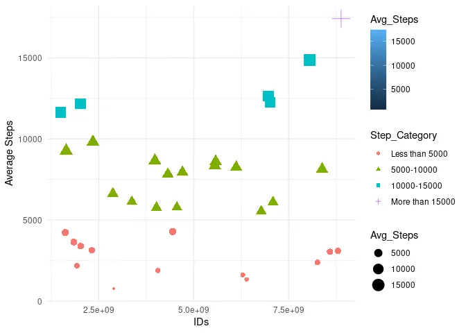
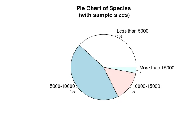
I have used four categories in general
      #Summarizing Total Steps by Mean
daily_activity_avg <- daily_activity %>%
  group_by(Id) %>%
  summarise(Avg_Steps = mean(TotalSteps), Avg_Calories = mean(Calories), Avg_Very_Active_Mins = mean(Very.Active.Minutes),Avg_Fairly_Active_Mins = mean(Fairly.Active.Minutes), Avg_Lightly_Mins = mean(Lightly.Active.Minutes), Avg_Sedentary_Mins = mean(SedentaryMinutes))

# Create a new column called "Step_Category"
daily_activity_avg$Step_Category <- cut(daily_activity_avg$Avg_Steps,
                                 breaks = c(0, 5000, 10000, 15000, Inf),
                                 labels = c("Less than 5000", "5000-10000", "10000-15000", "More than 15000"),
                                 include.lowest = TRUE)

#Scatter Plot (Avg Steps v/s Unique Ids)
ggplot(daily_activity_avg, aes(y = Avg_Steps, x = unique_Id, fill = Avg_Steps, size=Avg_Steps, colour=Step_Category, shape=Step_Category)) +
  geom_point() +
  labs(x = "IDs", y = "Average Steps") +
  theme_minimal()
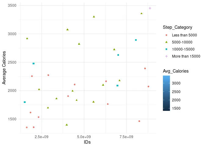
Let’s do the same with calories
      #Scatter Plot (Avg Calories v/s Unique Ids)
ggplot(daily_activity_avg, aes(y = Avg_Calories, x = unique_Id, fill = Avg_Calories, shape=Step_Category, colour=Step_Category)) +
  geom_point() +
  labs(x = "IDs", y = "Average Calories") +
  theme_minimal()
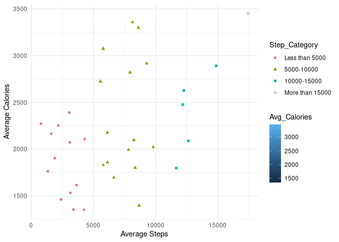
      #Scatter Plot (Avg Calories v/s Avg Steps)
ggplot(daily_activity_avg, aes(y = Avg_Calories, x = Avg_Steps, fill = Avg_Calories, shape=Step_Category, colour=Step_Category)) +
  geom_point() +
  labs(x = "Average Steps", y = "Average Calories") +
  theme_minimal()
      #Pie Chart (Steps Bifurcation)
mytable <- table(daily_activity_avg$Step_Category)
lbls <- paste(names(mytable), "\n", mytable, sep="")
pie(mytable, labels = lbls,
    main="Pie Chart of Species\n (with sample sizes)")
      #Activity by Week Day (metric -> Sum of Steps)
daily_activity$WeekDays <- weekdays(daily_activity$ActivityDate)

daily_activity_sum <- daily_activity %>%
  group_by(WeekDays) %>%
  summarise(total_steps_by_date = sum(TotalSteps), total_calories_by_date = sum(Calories))

#Bar Chart (Weekday v/s Total Calories by Date)
ggplot(daily_activity_sum, aes(y = WeekDays, x = total_calories_by_date)) +
  geom_bar(stat = "identity", position = "dodge", aes(fill= total_calories_by_date)) +
  labs(x = "Total Calories", y = "Weekday")
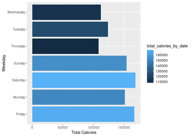
Here we can see that:
      #Extracting weekdays from Steps by Hours Data
steps_hourly$WeekDays <- weekdays(steps_hourly$Date)

#Sum of steps by weekdays
steps_hourly_sum <- steps_hourly %>%
  group_by(WeekDays) %>%
  summarise(total_steps_by_date = sum(StepTotal))

#Bar Chart (Weekdays v/s Total Step by Date)
ggplot(steps_hourly_sum, aes(y = WeekDays, x = total_steps_by_date)) +
  geom_bar(stat = "identity", position = "dodge", aes(fill= total_steps_by_date)) +
  labs(x = "Total Steps", y = "Weekday")
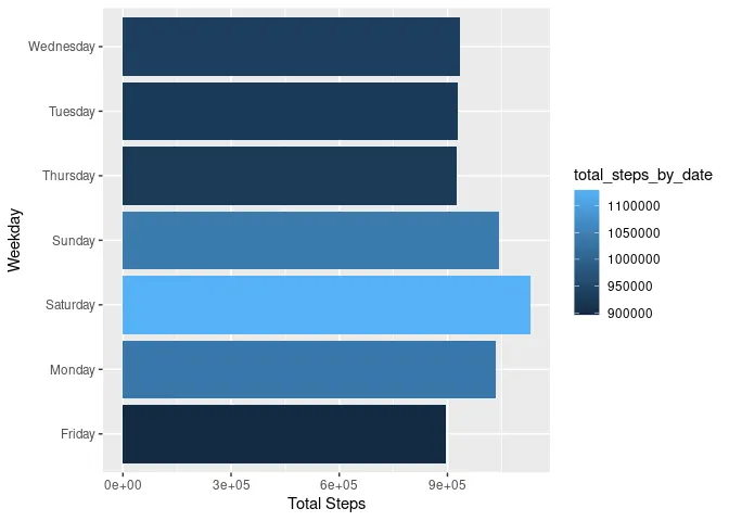
Here we can see
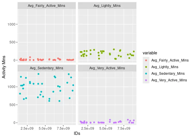
Understanding activity in terms of active minutes and hours of the day
      #Subset table for activity mins
Active_Mins <- subset(daily_activity_avg , select = c(Id, Avg_Sedentary_Mins , Avg_Lightly_Mins, Avg_Fairly_Active_Mins, Avg_Very_Active_Mins))

#Pivoting to longer format
Active_Mins_long <- Active_Mins %>%
  pivot_longer(c(Avg_Sedentary_Mins, Avg_Lightly_Mins, Avg_Fairly_Active_Mins, Avg_Very_Active_Mins),
               names_to = "variable", values_to = "value")

#Activity Mins v/s IDs
ggplot(Active_Mins_long, aes(x = Id, y = value, color = variable)) +
  geom_point() +
  labs(x = "IDs", y = "Activity Mins") +
      #Calorie by Hour
unique_Id_Calories <- unique(calories_hourly$Id)

#Avg Calories by Hour,Id
calories_grouped <- calories_hourly %>%
  group_by(Id,Time) %>%
  summarise(avg_calories_time = mean(Calories))
      #Time conversion for plotting on graph
calories_grouped$Time <- factor(calories_grouped$Time,
                                levels = unique(strftime(as.POSIXct(calories_grouped$Time, format="%I:%M:%S %p"),"%I:%M:%S %p"))[order(as.POSIXct(unique(calories_grouped$Time), format="%I:%M:%S %p"))])

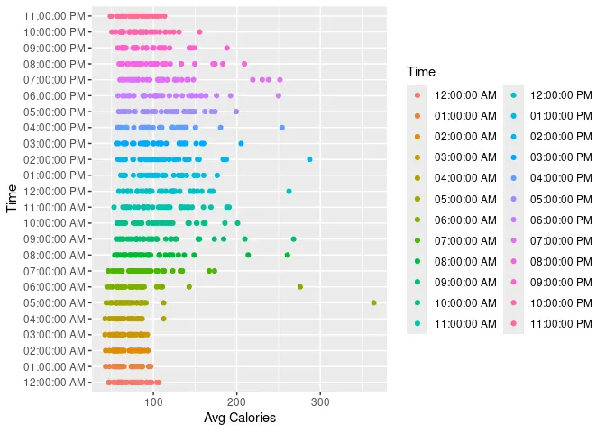
#Time v/ Avg Calories
ggplot(calories_grouped, aes(y = Time, x = avg_calories_time, color = Time)) +
  geom_point() +
  labs(y = "Time", x = "Avg Calories")
Understanding the intensities of activities
Activities can be light, moderate, or vigorous, according to their MET score
      #Summarizing METs by Id
METs_avg <- METs_by_minute %>%
  group_by(Id) %>%
  summarise(avg_METs = mean(METs))

#Creating categories for METs
METs_avg$MET_Category <- cut(METs_avg$avg_METs,
                                        breaks = c(0, 10.0, 12.5, 15.0, 17.5, 20, Inf),
                                        labels = c("Less than 10.0", "10.0-12.5", "12.5-15.0", "15.0-17.5","17.5-20.0","More than 20.0"),
                                        include.lowest = TRUE)

#Avg METs v/s Id (w/ MET Category)
ggplot(METs_avg, aes(y = avg_METs, x = Id, color = MET_Category, shape = MET_Category, size = MET_Category)) +
  geom_point() +
  labs(y = "Avg METs", x = "Id")
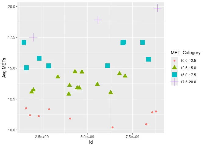
After understanding this we can create three personas



I will be sharing brief ideas for marketing for these personas
We can focus on Persona 1 and Persona 2 as they would yield high retention because of their use cases. The first impression should be solid to make that happen.